Thursday, March 26, 2009

Foto Love

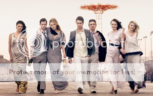
I saved this image long time ago. I really, really want to recreat it on our wedding day!

I don't know where I found it, please let me know if you do so
Thanks to Stampin Rachel, I know where I found it. It's from Vanity Fair!

Dear Lent,

This is the longest 40 days of my life. Giving up red meat is almost worse than the times that I've given up Diet Pepsi. I am d-y-i-n-g for a Vienna Beef hot dog on a poppy seed bun. (But I like mine plain because I am a purist.)

Image: Here
In anticipation of Easter Sunday, I am going to the grocery store and buying a package of S. Rosen buns and VB dogs to have on hand for my Easter Sunday breakfast. I don't care if I gain 10 pounds and get nitrite headaches. It will be worth the deliciousness.

Love,

Tina

Wednesday, March 25, 2009

Remember When I Said That I Wasn't A Beach Girl?

I lied. Snippet & Ink totally proved me wrong. I could be a Beach Bride at this wedding. Although, I don't know how I'd ever get Andy on a Vespa...

Original Images and Sources on Snippet & Ink.


I don't know how Kathryn does it. Her inspiration boards are such wonderful eye candy. Her daily posts are like sneaking a piece of Godiva a day without ever gaining a pound. She must have the patience and organizational skills of a saint! I remember how excited I was when I was assigned to her and Mimi in the first Brooklyn Bride Card Swap in 2007! Nerdy me scored cards from two of the cool girls!

Pretty Cake

So girly. So cute.

Image: Here

The Sugar Syndicate has updated their online portfolio. I know that I am partial, but I love these new additions. I wish that I could see the weddings that inspired them!


I really like this one:

 Images: Here

Tuesday, March 24, 2009

Beach Wedding Invitations

As I mentioned yesterday, my sister-in-law is getting married in Florida. I was lucky enough to design her invitations for her!

During the design phase, I was incredibly busy with work and she was beginning graduate school, so we had no time to get together to discuss a plan. We did everything via e-mail and text.

Her only request was "brown, blue, and a palm tree." I suggested adding coral to lighten things up. I sent her a few beach designs from real designers to get some perspective on her asthetic. She loved this invitation from Ceci New York.


Unfortunately, that beautiful rattan paper was nowhere to be found. My printer could get it for me for the price of a full invitation suite ($800). I finally figured out the right keywords and found it online, but it would have been $200 + expedited shipping, so it was out of the question.

I actually really, really struggled with a design for this project. I'm not really a beach person and couldn't let myself just toss a palm tree on a card and call it a design -- and, believe me, I tried. Poor Andy must have voted on 30 different configurations of cards with palm trees moved one millimeter. I needed something sassier. Since her wedding's taking place at a resort near Palm Beach, Florida, I had the Kennedys on the brain and, as a result, couldn't get preppy rattan furniture out of my head. So, I combined my kitsch with her beach to come up with this logo:


Thankfully, she liked it! Here's the final product:


My printer had the EXACT number of envelopes needed in the most perfect blue-green color.
The color is not-quite-Paper Source Pool, so I got lucky finding these few envelopes at the printer.


The Latin Jazz stamps were perfect
for my jam band sister-in-law and drummer brother-in-law to be.
Andy's mom liked them almost as much as the envelopes.

Image: USPS

I used wrap-around labels. Even though they're twice the work,
I'd rather sit and cut and glue for two hours than sit still and write neatly for one hour.


 I lined the envelopes in papaya-colored paper from Paper Source.


The front page of the invite.


 The full invite. I did not intend to use the tri-fold design again,
it just sort of happened due to time and expense.
I was really behind schedule on this project, so I didn't have time to cut things myself.
Paying the printer to cut for me wouldn't have been cost-efficient for 25 invitations.


The back of the postcard.


Thankfully, she didn't want a map or any other details included on the back. Thank God. I hate maps. From what I hear, the invites are getting good reviews. I feel so much more pressure to do well because I know that Andy's family tells people that I'm into this stuff.

I'm about to ship some tote bags, schedules, and menu/place cards down to Florida tomorrow morning. I'll share those projects next week so that I don't ruin any surprises for the wedding guests.
Monday, March 23, 2009

An Afternoon Tea Shower

On Saturday, we celebrated my sister-in-law's upcoming wedding with an Afternoon Tea in The Lobby at the Peninsula Hotel. It was so much fun! My friend and I hosted a tea for a friend at The Drake a few years ago. I think that the Pen wins hands down.

This outing was planned a bit impromptuly, so I literally had to get invitations out overnight. I did a kamikaze run to Paper Source and, thankfully, found some AWESOME invitations with a tea pot on them. To off-set my DIY-Poser guilt for using store-bought invites, I bought some cards and labels to customize them a bit.


I wanted to do a "Two's Company, Tea's A Crowd" theme, but Andy intervened and wouldn't let me humiliate myself with such an awful pun. Hindsight being 20/20, I should probably thank him for that.

When we were on vacation last summer, my sister-in-law's celly was burnin' up with calls from her dude. I nicknamed her phone "The Hus** Hotline."


These are my favorite part of the invites. I cut a slit where the "lid" would open and "hung" a "HuskTea" bag from the inside the pot.


For favors, I picked up some small tins of Wedding Tea and tea bag rests from Crate & Barrel. I topped them off with blue and orange bikini-shaped sugar cookies from Sarah's Pastries & Candies. (This was a fun coincidence since she's having a blue, coral, and brown beach wedding in Florida.)


I used paper and labels from Paper Source to decorate the plain white bakery boxes from Sarah's.


I made menus by scanning the Paper Source invites, recreating the invite design, and mounting them to fit on front of square cards.


I then printed the menu on the inside. I was out of steam by the time I was working on these and kind of tossed the design together, but they turned out pretty cute.


The Peninsula staff had everything laid out for us when we arrived.


All of the food was delicious. It's amazing how finger foods can so painfully stuff you.


And the bride-to-be seemed pleased with her gifts.

Thursday, March 19, 2009

The Venue

Venue shopping was not quite as much fun as I had expected. We originally found a perfect art nouveau building with a superb restaurant located right next door – which nipped any catering problems in the bud. Great, right? Well, not really.

During our first appointment with the venue contacts, they told us that all of our requests would be possible, including hosting the ceremony on location. During our had our second meeting to discuss the details, they informed us that transforming the spot would be too much work. Instead, they offered us the ugliest room that I’ve ever seen. I’m not kidding. It had white panels with muddy blue stripes all over them. I actually cried when I saw the room that they were suggesting. But then the anger took over and I told the venue contact that this room was not worthy of my time. So, we had to let go the beautiful venue and head back to the drawing board.


The search for a new venue was nerve racking! The more venues we toured, the more appealing an intimate wedding somewhere on a beach surrounded only by our closest family seemed. I even thought about eloping (especially after seeing this elopement.)

In the end, we found the perfect place —at least for us. We want to have a modern, chic wedding and our new venue fits the bill perfectly. We will exchange our vows "over" a river in a conservatory overlooking the water. Cocktails will be served outside (cross your fingers for good weather). While we’re outside enjoying the cocktail hour, the conservatory will be changed into the dining area. And for the party, there is enough space for a dance floor and a lounge area. There is even a super cool bar! The front of the bar is gold and the back wall has purple lights – thus our gold, purple and light rose color palette.


Photos by us

Wednesday, March 18, 2009

Please...

Image: Here

Tuesday, March 17, 2009

Happy St. Patrick's Day!

Image: Here

I gave up red meat for Lent. Can I eat corned beef since it is a holiday?

Monday, March 16, 2009

Tea Cups

Don't ask me why, but I totally have a thing for tea cups. It started when my mom and I started antiquing about 10 years ago.

I registered for Kate Spade Gwinnett Lane China simply for the tea cups and bowls (my other odd obession). I am already planning an afternoon tea and ice cream social for my girlfriends just so that I can use these pieces. (We haven't even looked at bigger condos yet and I already have four parties mentally planned.)

Image: Macy's

I'm currently loving these delicate lovelies from Anthropologie.


Thursday, March 12, 2009

Photographer

Back in Switzerland, I took a deep dive into the wedding world and have not emerged ever since. From the very beginning, I knew that I want to have GREAT pictures of our wedding day, so my first and most important concern was finding the perfect photographer. Through the WPJA, I found a talented photographer in Germany (located right next to Switzerland). I sent him an e-mail and he responded immediately (in fact, his answer was in my mailbox after 10 minutes!!). We phoned and I was sold the minute I spoke to him. He seemed to be a very nice and calm person, just what I’m going to need on my wedding day. We met him for an engagement session and I’m even more pleased about his work after seeing our pictures. They are amazing...


Shoes and my hubby to be, I love this shot!


we both love to shop, how appropriate


All photos by our wedding photographer Schwarzbild

Want to see more? Go here

Wednesday, March 11, 2009

Bestill My Beating Heart

This dress.

Image: Vera Wang


This dress.
This dress.
This dress.

This dress is the dress-equivalent of the green Christian Louboutin shoes that made me pout last spring. This dress makes me fantasize that I am so wealthy that I think nothing of purchasing a dress that is, at the Vera Wang Luxe minimum, more than 10 percent of the median income average for the United States. And then it makes me silently pout about the reality that I am not wealthy. (But only for a  minute, I swear. I am very grounded.)

This Brooklyn Bride post is the first time that I've ever seen the dress on a real person. I actually gasped out loud* when I saw it. I think that I've looked at these photos at least a dozen times today. This bride is stunning.


My 30-year-old self would have rocked this dress. But that was then and this is now. I would have starved myself and hired a personal trainer for that dress. Andy would have hated that flower. But I would have LOVED that flower. And my friends would have laughed and said, "Only you, LT." And I would have shrugged my flowered shoulder at them and ran my layers of silk organdy through my fingers flirtingly. Or maybe I would have had the flower removed and had an organdy overlay made so it wouldn't be strapless. (You know, since I'd be so wealthy.)

*I've only gasped once before. Over pretty.pretty.paper's ensemble.

One Dress. Two Looks.

I stumbled upon this Real Wedding in Knot Chicago magazine back in February 2008 and immediately  began the scavenger hunt for The Dress. I still remember flipping through the magazine as I walked back to my office from the bookstore, seeing it, and screeching. I recently re-stumbled upon the wedding and noticed how differently the other bride and I interpreted the dress. I always love seeing how different people accessorize the same piece. It's my favorite part of spreads like "Who Wore It Best?" in Us Magazine. Check out our side-by-sides.

We both went for real flowers in our hair, but she wore her hair upswept and romantic, while I went with a faux beehive.

Images: The Knot and Sarah Alair


She wore traditional white shoes and I went all Solid Gold Dancer.

Images: The Knot and Sarah Alair

She wore a long veil with traditional pearls. I wore a birdcage veil with moonstone jewelry.


She went with beautiful traditional white and green flowers. I went with bright autumnal flowers.

Images: The Knot and Sarah Alair

Oh, and she had a better tailor than me.


That shoddy tailor job will chap my hide until the day I die. It looks like a completely different dress in the back. I should have coughed up the cash and brought my dress back into the city to be tailored. Lesson learned. You get what you pay for.

Has anyone else seen photos of other brides wearing the same dress that they did?

Tuesday, March 10, 2009

A Jenny Packham-Inspired Wedding

I fall in love with this Jenny Packham dress every time I spot it in a magazine. I just adore Jenny Packham's asthethic and vibe. I think that if I would have had a smaller butt and a bigger dress budget, I definitely would have tried to get one of her beautiful gowns.


I would love to host or attend an event inspired by this fabulous gown. If it were my day, I'd host it at the Chicago Illuminating Company. And I'd step out of my bright-color comfort-zone and compliment it with this fab cake from Chicago baker Amy Beck.


Monday, March 9, 2009

Using One Envelope for Your Invitations

As much as I love paper, I am a huge fan of using a single, pretty envelope for wedding invitations. It saves trees and some greens on your part. In light of this, I guarantee that I broke some rules when addressing the invitations for our wedding. I totally dig this outer envelope for an entire family designed by Pretty Pen Jen. So cute!